Wednesday 16 December 2009

JP - Evaluation Part Three:

What have you learned from your audience feedback?


  • In order to create a slick, original and entertaining music video we listed audience feedback and the points of view from a questionnaire as one of our main priorities to address.

Target Audience

  • The target audience for our concept is aimed at teenage girls or teenage boys, our video would appeal to both young teenagers and older from ages between 13-18 year olds. It was important to test our concept in pre-production to an audience of young people because they gave us an idea of what they could expect and what flaws were apparent in our idea.

Techniques

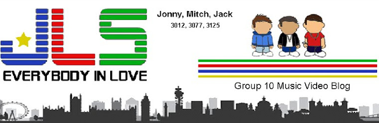
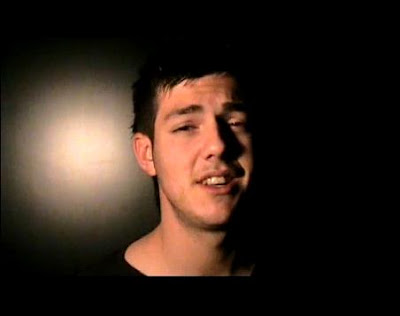
  • To reach out to our audience we used a number of different shots and techniques to enhance this. Shots such as close-ups, meat shots and establishing shots all contributed towards engaging the watcher as fully as possible.

  • These are just some of the techniques we used to appeal to our target audience by gazing into the camera as if we were singing directly to the viewer. Throughout the whole process of making the music video we constantly tried to meet the guidelines of our audience feedback.

Audience Feedback

  • The results showed that our overall concept worked very well. We tested a rough cut of the video to a watching audience who provided some highly positive comments and improvements we could make to enhance our final version. The watching audience believed there were several aspects that we could change such as incorperating females and maybe a slight narritive into the piece.
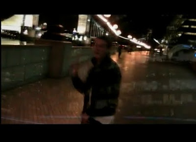
  • Also introducing new group shots, as most of the performance shots
  • When watching our video several times we were asked if we were going to incorporate a female character. We were encouraged to put in some shots of a female which would potentially add an extra dimension to our work. However we discussed the idea and decided against it, we felt that we were happy with the overall look to our video and felt we didn’t need to involve a female character.

  • To test the finished pieces to an audience we watched the videos in class with questions for the audience to answer which we later collected. This showed us the strengths and weaknesses to our video which we could later improve on.

  • Finally we carried out a recorded interviews with our target audience who have previously seen our final version. We asked a series of ten questions to find out specific answers to the making and meanings behind our media concept. However we didn’t limit our study to just males, we also asked teenage girls to comment on our video in an interview style which proved to be beneficial and positive throughout.#


Monday 14 December 2009

JB & MH - Evaluation Part Four:

How did you use media technologies in the construction and research, planning and evaluation stages?


Blogger

Throughout the whole process of making our music video, planning and evaluating it we have used blogger.com as a collaborative e-portfolio. For example this has helped us document certain parts of our construction such as our storyboarding animatic, and our call sheets and risk assessments when booking out camera equipment.


This is the Blog archive in which we
were able to organize are posts and
control who was posting what by
making them clearly marked with
our initials.
This shows how we
were able to comment
on eachothers
work and add in
our own
opinions.


  • This is an example of web 2.0. This is because it is a concept of is this new age of internet. It allows people to connect with eachother and communicate, and change what is actually on the website. This is unusual, because websites used to just be information shared that is provided by the owner of the website.

Planning


  • In order to plan our pieces we used a storyboard. This took a lot of time and we tried to think really carefully about each shot.

  • The storyboard could later be turned into an animatic as you can see here:


  • http://www.youtube.com/watch?v=KwpEHR-yftk


  • Furthermore in planning we also had to think about what was actually possible to shoot as oppose to what we would do if we could do anything at all with no limits.


  • We created the animatic using Adobe Premiere Elements, this was useful because it meant that when it came to our construction of the music video we could match our video to our animatic.


  • When shooting, we used DV cameras. The main challenge that we overcame was lighting. Because we chose to shoot at night we found it extremely hard to shoot with the DV cameras. Through using lights on location and studio lights for close up shots we managed to overcome this problem.


Editing (Premiere Elements 3.0)


  • Using Adobe premiere Elements 3.0 we were able to create some techniques in editing our video.


  • The first technique, has been said about in Part One of the evaluation and thats the Fade. This has helped our video look more authentic.


    As you can see from the clip at the end fo the vide, fades helped our video dramtically in shot changes. its gave us a smooth changeover of images and made our video more slick and easy to watch.


  • Secondly, we used the image control toolbar to adjust the colour and hue to the footage.
    FOR EXAMPLE


  • Thirdly, we used a ghosting effect on certain pieces of footage, for example in this shot of mitch:


  • This effect was created through changing the opacity of all three clips and laying them on top of eachother. This again can connote the waiting up late at night, referring back to the link between the visuals and the lyrics through the night lights, showing two of our locations.


Digi-pack & Advertisement


  • We then also used a Digital Stills camera to take photographs for our digipak however, we chose not to use them because we felt the other design was better, and the photographs were not very good quality.


  • Adobe Photoshop

    • In Adobe photoshop we manipulated our oringal drawings that I created, by cutting out the colour in them and replacing the coulour with that from photoshop...
    • To do this I used the magic wand tool to select colour
    • Then I used a colour brush to fill the colour on the back ground layer.


    MS Publisher


    • In MS Publisher we then used a bookfold style page as the basis for our digpak and advertisement, as this allowed us to set out specific measurements that we got from magazines and previous digipaks. we set out the page at 14.5x12 for the digipak.


    Audience Research

    • After all this construction work, it was time to see if it all paid off and if we got the response that we wanted. We carried out some audience research and we thought we'd do it interactively by doing some short interviews. This worked very well and we came to the conclusion from our results that we got the exact right response we wanted.


    • One thing we found that was missing from our music video was that we didn't have a girl. This was a factor that we definately took into account when creating our video but we just felt like the video was good without it, and we also felt as though it challenged some conventions you would expect to see in a boy band video.


    Thursday 10 December 2009

    MH - Evaluation Part Two:

    How effective is the combination of your main product and ancillary texts?

    The brief was to create an advertisement to promote the album of the band that our music video was made for.

    • We set out to design an image that made the genre of the band apparent, whilst giving the boyband an image that would appeal to the target audience and influence people to buy the album.
    • We originally chose to design and advertisement to take up half of a page in a teenage girl’s magazine such as ‘Disney Girl’ & ‘Total Girl’. These magazines are primarily the most effective in advertising a band such as JLS as teenage girls are the target audience.

    • We decided to each produce a version of the advert and how we each thought it should look and then decide what version was better and develop it further.

      Heres My attempt:

    Heres Jack's Attempt:


    Heres Jonny's attempt:
    • As you can see, mine and jacks idea, although following all of the typical conventions of our genre, struggle to create an interesting image for the viewer. this is a vital part of an advert because if the image is not appealing, it will not get as much attention.

    • However although jonny's attempt in some ways challenges the expected look of a boyband advertisement in the way that it is animated, it is different and postmodern in the sense that there is no photo of the band, only drawn images. so in the light that jonnys advert is more effective to an audeience, we decided to develop his idea and use drawn images in our advertisemenet.

    • However, the look of the advertisement, is not one that you would expect to find in a teenage girls magazine. and although this was primarily our target audeience, we had to re-evaluate what magazine should host our advert and what audience this advert would reach out to.

    • The types of magazines we came up with was the type that reached out to young males, and due to the origin and nature of our band, it would probabaly be in a more urban, hip-hop magazine. One example is 'The Source' and possibly 'NME'.
    • Richard Dyer was an american critcial theorist who talked about the importance of images in media. His concepts are relative to our advertisement as there is emphasis on star image throughout our art work.

    • Dyer expressed the vitality of aesthetics throughout advertisement to portray the product or band in a certain way. for example in typical boyband advertisements, a band image is presented to give the audience an immediate view of the band or product being advertised.

    • A boyband advert should consist of meat shots, close ups of the band memebers' face to fully present the cult of youth & beauty and introduce the 1st person mode of address to make the audience feel like the band is connecting with them and so they feel relative to them.

    • Dyer also talked about the star image. which in this case would be that these young middle class men, have been turned into stars and displayed through advertising as these completely different people to who they really are, to sell a product or promote the band.

    • Dyer claimed, the reason that images in the media are open to repeatability and the audience want to look at them is due to the ordinary and extra-ordinary factors of these products. the way that the audience can feel like the star's in the images are just like themselves, however there is an additional factor which is extra-ordinary about them. this could be the lighting, make up, and effects applied to the images to make them appear extra-ordinary.

    • we challenged this expectation ultimately, as we did not use a photograph of the band but used an animated image so there was no meat shots or mode of adress only an image of the three boyband members to promote the band in a more urban way to reach out to the young males and females into R&B or hip hop music.

    • it could be argued that this is a form of advertisiing the band in the way that the image is reaching out to a working class or deprived audience in London or urban areas, so that the band can be an inspiration to the audience as three young men from London themsleves, into stardom.

    • The Digipack, was relative to the advertisement. we decided to go for an animation feel, to confrom to the urban animated feeling to our products. However each of our products (The Video, The Advertisement & The digipack design) are all undoubtedly connected in the following ways:

      • Each product displays all three of the band members
      • Each product conforms to our urban feel, whilst avoiding the gritty, violent and dark side of London City and so each product is suitable for all ages.
      • If you apply Dyers critical framework, each product represents the band as star images.

    JB - Evaluation Part One:

    In what ways does your media product use, develop or challenge forms and conventions of real media products?


    Goodwin

    • Using Goodwin’s theory of critical framework, the genre of our music video was apparent in the way we used the conventions and characteristics to match other boy band music videos, for example we made it a performance based video throughout, and the mise en scene we tried to convey, such as the city lights, all conform to characteristics of pop genre. We also used conventions like a series of establishing shots at the beginning of the video in order for the audience to understand our location choices. The notion of looking is used a number of times throughout the video where the artists look at the camera towards the audience.

    Lyrics and Visuals

    • There is a link between the visuals and the lyrics, and I feel as though we needed to do this a little bit, but not too much as then you may lose some authenticity to the video. An example of when we use this link is for small touches, such as in Jack's verse at the end he says 'get up and walk away'...


    • Futhermore when we used the chorus there was a link between the visuals and the lyrics for example: 'Go put your hands up...'


    Conforms


    • The music video is conventional boy band music video because it is performance, however it is post modern because of the way it is commercial and a piece of art at the same time.


    Challenges


    • The form of our music video challenged conventions in the way we chose to fit a much more urban style, and the locations we chose for example, London, Blue Water car park, and Greenhithe Abbey.


    • To enhance the urban, gritty feel, we chose to shoot at night in which would invite a lot more problems with lighting; however we managed to over come this issue with some Battery powered hand held lights.


    Audience Research


    • Furthermore, a way in which we challenged the typical conventions of Boy Band Pop genre music videos, after much deliberation we decided against involving a female and a ‘love’ narrative. This was a risky decision, and even when carrying out some audience research after the video, some people when asked 'What is missing in our video' suggested that there could have been a girl.


    Visual Techniques


    • We also tried to use a lot of visual techniques to enhance our conforming to the genre. For example in our car park performance shots we used a panning motion in which we actually circled the performers. We did this through me driving, and some one else holding the camera steady in the car. Luckily as it was late at night it was perfectly safe to do this in the empty car park.

    • Another technique that we felt added to the authenticity of our music video was fading.


    • This was something that we picked up on after studying numerous other boy band videos and we feel it adds to the emotion and links some of the visuals and the lyrics by creating a bond with the audience.


    • A variety of shots means that the audience can know the location they are in. The quick paced editing anchors this camera work, by being in time with the music.

    • The speed of our camera work has also enhance the somewhat euphoric feeling we are trying to convey for example in the car panning shots.


    Semiotics


    • Using Semiotics in our construction has allowed us to show the meaning through visuals for example the clothes that the boys are wearing. Shiny leather jacket that Mitch is seen to wear connotes an urban feeling and this is exactly what we wanted.


    • We made sure that the boys didn't just wear what they wear in everyday life becuase we wanted to signify a street look, to add to the star image and the boys meta-narrative.


    • Another way in which we have done this is through certain Star motifs. E.g. The Necklaces Mitch wears are in most of his shots:


    • Also Dom's Dancing:

    • Iconic Signs such as our Location in London act as signifiers to the british boy band feel, as well as the car park.


  • As well as this we used intertextual references to popular culture through the street dancing from Mitch and Dom, in which this will add to the Grand/Meta - narrative and this will appeal to their target audience.

  • Other conventions such as the performing and dance sequences which create a divide between the video and the performance.


  • By association with London and the clothes they wear, our boy band are therefore endowed with the 'myth' that typical british boys/lads, can become successful if they are talented enough. This is shown through the dancing and singing.


  • Furthermore, the ideological discourse of gender is shown through deciding not to involve a girl in the video and keeping it to just the boys doing it for themselves.

  • Friday 27 November 2009

    What type of Music video would you expect a Boy band to have?

    From this graph you are able to see that the majority of our feedback said that we should use a mix between performance, a story and an abstract concept. In the end we have decided to go with a performance based video throughout. Each member of the band has taken a verse in the song which they mouth the words to.


    We are planning on doing more urban/edgy type music video. Which of the following would you expect/enjoy in this style of boy band video?

    From this graph we are able to see that the majority of people said that we should include ‘visual effects’ as shown on the purple bar. Others said that we should include female dancers but we decided to go against this as it didn’t fit what we were trying to achieve.


    What sort of personality would you expect the band members to have in the video ‘everybody in love’?

    From our feedback the majority of people suggested that we should take a ‘happy/joyful’ personality. The least amount of people said that we should include a ‘risk taker’ scoring 12.5% and someone who is ‘depressed’ also scoring 12.5% on the pie chart.

    Tuesday 17 November 2009

    MH- London shoot 2.

    Tonight, being Tuesday the 17th of November, our group will be making our second trip to London together. We understand that we need more varied shot sizes; furthermore we need some new performance shots of the group all together, as we only have one shot of this and we need multiple for the chorus,
    We also need jack to perform the whole verse again. And we need more shots of close ups of the band members faces. Finally we need some more establishing shots as we need these for filler shots.

    Sunday 15 November 2009

    JB-Final Digi-Pak Layout Design


    This one below is the final copy of our finished Digi-pak and Advertisement...Then below you shall find some planning production stages it took to get there.


    This is the booklet that we would provide within the front:


    PLANNING:

    After playing around with ideas, we decided to go ahead with the cartoon idea as it adds to our boy bands playful personas.
    At home I drew some characters on a much larger scale, so that when scanning them in the lines would look a lot smoother and more prominant. This also gave me the oppertunity to play around with clothes and colours more:


    When I scanned them into photoshop it took a while to figure out the best way of filling the colour and that was through aranging the layers correctly and a major issue was through giving the right measurements of an album Digipak. After using 'Blue - Guilty' as a foundation for my measurements the final Digi- Pak design is as follows in order of how you would open the pack:


    Thursday 12 November 2009

    MH- didipak design idea 1.


    this didgipak follows all of the conventions of a boyband digipak. it has images of all three of the artists and a banner of the name of the group centre-tiop of the cover.

    Wednesday 11 November 2009

    JB - Digipak idea or Advertisement #2.

    This is an Album cover from Pharrell Williams, a rap artist. After many group discussions we have realised that this simplified cartoon style is definately something that is appropriate for our digi-pak. We love this album cover and the simplistic style. After discussing the idea further we tried to think of the best way to carry this out. Originally we thought we could use photoshop for all the cover but after attempting it a couple of times doing it different ways I have found that it would be better to design and draw the cartoons of the three group members. Out of the group we decided that I would draw them, and we experimented with one idea during the lesson on Thursday the 12th November. We then developed the images further.


    For instance; Here is one that was made in the lesson:

    Here you can see the hand drawn cartoons of the band. The colour was done on photoshop after I scanned the drawings in. The trouble with this was the smoothness of the lines, therefore in the next mockup of the idea I must draw them alot bigger. The colour being filled in on photoshop is much more proffessional looking and could look like something made by a illustrator.

    Tuesday 10 November 2009

    JB - What is left to shoot...

    Here I have taken the lyrics from our song and highlighted the key areas in which we have to either shoot, or re-shoot to complete our filming of our music video. as you can see the majority of our filming has already been done on our previous two shoots, in which you can see evaluations of further down our blog.

    JB - Planning And Organising our Progress


    The two scanned images above are the calender style sheets we have used to document our organising and planning for each lesson, weekend, half term and film shoot. In this we are able to document the work each crew member completes each lesson and make sure that we stay on track for the deadline.

    Monday 9 November 2009

    JB - Font Ideas

    Here is a post that just shows some of the ideas we have been working on using for our digi-pak and advertisement. You can see that they all appear very young, retro, urban and modern, all of which we want to come across in our Grand Narrative and Star Persona of the band.

    Sunday 8 November 2009

    MH- London reccie

    for our first shoot, we caught the train to london, as our ideas involved shooting in an urban area. as we made our trip at 6.oo pm on a wednesday night, it became wuickly evident that the business of the streets would cause a problem. we had to find derelyct parts of the streets to shot our performance shots, as if they were perfromed in front of a passing audience the camera would cathc them staring at us performing/ filming and would ruin the shot. however to find a well lit area without passers by proved difficult and so we only managed to catch a few useful shots to use ofr our video. we managed to get a good shot over the thames with tower bridge n the background, but could only partly be used because of pedestrians. moreover light proved a major issue whilst filming. because the cameras arent very effective when used in poor loght conditions, sometimes even in a well lit area the shot isnt clear. jonny brought along a hand held torch which was a bright l.e.d and although this improved the light conditions if shon upon the perfromer, the shot when analysed did not look right because of the blueness of the light on the perfrormers face did not look intentional and did not work. the last issue with the filming was the factor of embaressment! erach performer was reluctant to perfrom due to the attention caused by the camera etc. as the night progressed we understood more about what we neded to do to achieve quality fotage in an urban area and so decided to treat the first shoot as a reccie and learnffrom our mistakes.

    Friday 6 November 2009

    JP-Evaluation of shoot (Bluewater and Greenhithe)

    On Tuesday 3rd of November, Mitch, Dom, Jonny and I all drove to bluewater to shoot some key scenes for our music video. We were going to use the car parks as a location to gain an urban effect which conforms to our music video ideas. Obviously Bluewater shopping centre is a popular attraction which hundreds of people use so we needed to decide on a time for shooting our scenes. After discussion, we decided to meet in the car-park at ten o’clock so not many people and cars were there.

    We began shooting in the John Lewis car park on the top level, the lighting was superb for the image we were trying to achieve. All in all our shoots were very successful, looking at them on a computer screen allowed us to see just how good our shots turned out. Each and every member of the group is extremely pleased with how it went and the outcome is perfect. At first we were concerned with the lighting because obviously we chose to shoot in the dark so we didn’t have the advantage of sunlight. Instead we had to use our own source of lighting E.g. car headlights, street lights etc. After we had achieved what we wanted at bluewater we felt we had enough time and the weather was just right for us to then drive to Greenhithe castle to complete some of our other key scenes there.

    Things that went well

    The quality of our shots turned out very well, we had the opportunity to get a lot of our shots done and we did. One of our big worries was that there might still be cars and people in the car park but in the end it was completely empty which meant there were no distractions of stoppages in our filming. Another worry at the beginning of the day was the weather. During the afternoon of Tuesday it was raining heavily and it was extremely cold, luckily for us, by the evening the weather cleared up and it was perfect to shoot in. The lighting was also a success, it is easy to see our faces throughout and the backgrounds look great in the dark with just the right amount of light. In a way we found it a good thing that it rained during the day because by the evening most of it had cleared up bar a few puddles which was very beneficial because the light reflected off the puddles to create a nice effect.

    Things that didn’t go so well

    Even though most of our shoot went well there were one or two things that didn’t quite go to plan. At time during the shoot the lights were turned off in the car park but luckily they came back on again a few minutes later. The framing was a difficult task at times but we feel that we overcame this and were able to get some really good shots.

    Thursday 5 November 2009

    JB-Screen shot of Call sheet and Risk Assessment


    Here is a screenshot of both our risk assessment and our call sheet. This is to help us keep track of equipment as we hand the both in to he department for hiring out our camera equipment. It also helps us plan the risks we may encounter on shoot, and keep track with our story board...however our story board seems to differ from our actual video.

    Tuesday 3 November 2009

    JB - Digipak design #1


    click on image to enlarge


    Here is a first draft of an album digipack front and back cover. In our final digi pack there shall also be an inside to both of these covers therefore making four sides in total. This was done on photo shop by taking a london sky line then creating a cracked affect by using the magnetic lassoo tool, and then filling a background colour a bright red/pink, and adding a different contrast and title. When making this digipak, i wanted to show the urban feel and when on shoot i noticed that in london the bright neon red lights seemed to show alot in our footage therefore this kind of design would correspond with that video.

    Friday 23 October 2009

    Group Animatic

    The link above will take you to our animatic for our music video - this will be the foundation of our plan when we go on shoot, and it has given us a great indication as to what we need to do when on shoot...All that is left now is to shoot and edit...

    JB - Shot Ideas: Part 2


    http://www.youtube.com/watch?v=8ZBQwHd_1Vo

    As you can see, above are just a couple more ideas of ways to carry out certain shots, and emotions that we want to convey on screen. The black and white photo from East 17's 'Stay another Day', shows how using black and white on flash back narrative sections can have a huge impact to the type of mood it gives, mainly a sombre feel adding to the theme of love in boy band songs. Also the CU's of *Nsyncs 'Girlfriend' shows how it adds to the sexual magnetism of the boy band which is one of Richard Dyers key terms when thinking about 'Stardom'.